Renderer Tab
In most interaction types, the Renderer tab consists of a Configuration panel on the left and a Design panel on the right.
- The Configuration panel allows you to enter a name for the interaction element, select the interaction sub-type, and configure the interaction's properties.
- The Design panel allows you to design the appearance of the interaction.
Figure 7: Choice Interaction Editor Window: Multiple Choice: Renderer Tab
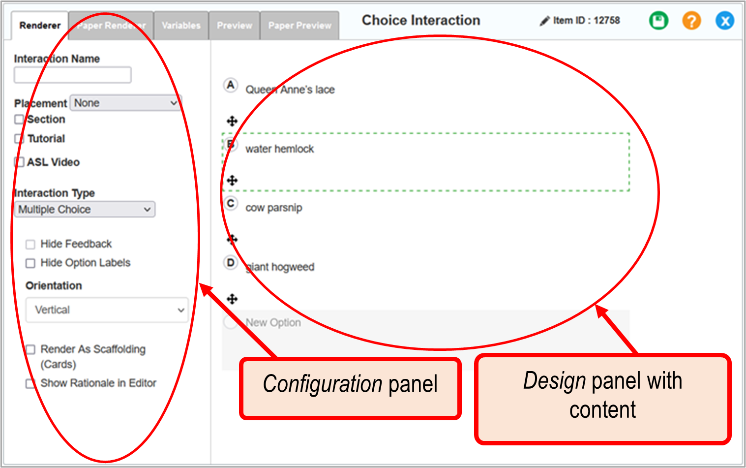
The configuration properties and design options on the Renderer tab vary by interaction type, but some features are common across all interaction types.
Figure 8: Interaction Editor Window/Panel: Renderer Tab: Configuration Panel
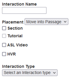
Common features in the Configuration panel (Figure 7) include the following:
- The Interaction Name field allows you to enter a name for the interaction. This name appears on the interaction element in the Item Body Canvas and as a label in the standard Rubric Editor. It does not display for the student.
- The Placement drop-down list, which appears only on item interactions, allows you to select the interaction's position in the item layout. The position options available depend on the selection in the Item Layout drop-down list on the homepage. Possible positions are as follows:
- None places the interaction in the default position.
- Move into Passage places the interaction in the stimulus.
- left column places the interaction in a column on the left side of the item.
- right column places the interaction in a column on the right.
- The Section checkbox, when marked, causes the interaction to appear as a section in the item. When you mark this checkbox, radio buttons and a field appear below it. If you want students to be able to expand and collapse the section, select the Collapsible radio button. When Collapsible is selected, default visibility can be either Expanded or Collapsed. Enter a label for the section in the Section Header field.
- The Tutorial checkbox allows you to include a tutorial for the interaction. Mark the checkbox, select a tutorial from the drop-down list that appears, and click outside of the drop-down list. This option does not appear on stimuli, Rich Text, or Slideshow. If you added a tutorial to the whole item, you cannot add one to an individual interaction.
- The ASL Video checkbox, when marked, allows you to upload a video that translates the interaction's text content into American Sign Language (ASL). The student will be able to view the ASL video by selecting an option from a menu and clicking a button. If you need to make changes to the ASL video after uploading it, click the filename below this checkbox. For more information about uploading videos, refer to Inserting Video in Appendix A.
- The HVR checkbox appears on some interactions. When marked, it allows you to enter the text of a human voice recording (HVR) script and add an audio file. For more information on human voice recording, refer to Appendix F.
- The Interaction Type drop-down list allows you to select the interaction sub-type. This drop-down list only appears on interactions with multiple sub-types.
 Related Topics